
|
Annual ReportCompany: Orange County Business Journal
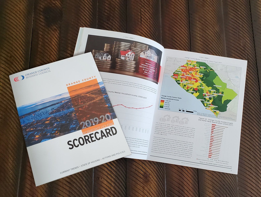
Project: 2019-20 Workforce Housing Scorecard Objective: Every year the Orange County Business Council sends out a workforce housing report to all businesses within Orange County. The report shares a plethora of data collected the previous year about what cities are doing the best financially, have the most housing inventory, have the most commerce etc. OCBC will hand off all the data and it is my job to make sense of it all and create a report that is visually appealing as well as easy-to-read and informative. The team at OCBC put a lot of effort into this report as well as the event they hold to introduce it. They spare no expense! For this report, I chose to use a vivid color palette with solid color overlays atop of the photos where highlighted text could reside without having to cut down on visual space. Also, using a san-serif font with a 90% black, made it less intimidating on the eyes for reading. The CEO of OCBC was very pleased with the layout I did with this and was thrilled to share it with stakeholders and business around Orange County. |
|
Passport BookletCompany: Cox Automotive
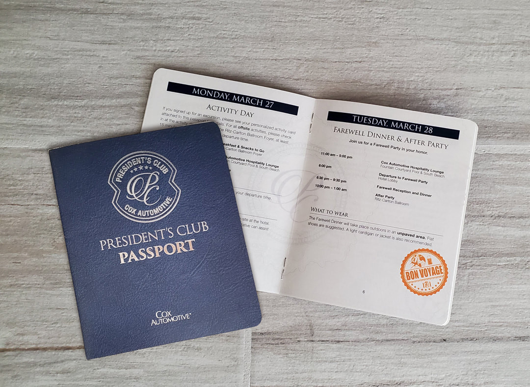
Project: President's Club Travel Itinerary Objective: The President's Club is a select group of people who have exceeded sales goals for the year at Cox Automotive. Every year, the people who make President's Club, get to enjoy an all-expense paid trip to Cancun, Mexico with the rest of their counterparts from Cox. When approached to work on this project, I was informed that there was a decent budget to create something fun and interesting for the travel itinerary. I suggested to create a passport that would be embossed and foil-stamped on the cover to give it that authentic passport look and feel and lay the pages out on a pearlescent white stock complete with watermark to really give it a polished appearance. We left space on the end of each day for the employees to collect a stamp to show they had attended that day's activities. The company executives spoke very highly of the piece and appreciated all that I had put into it. |
|
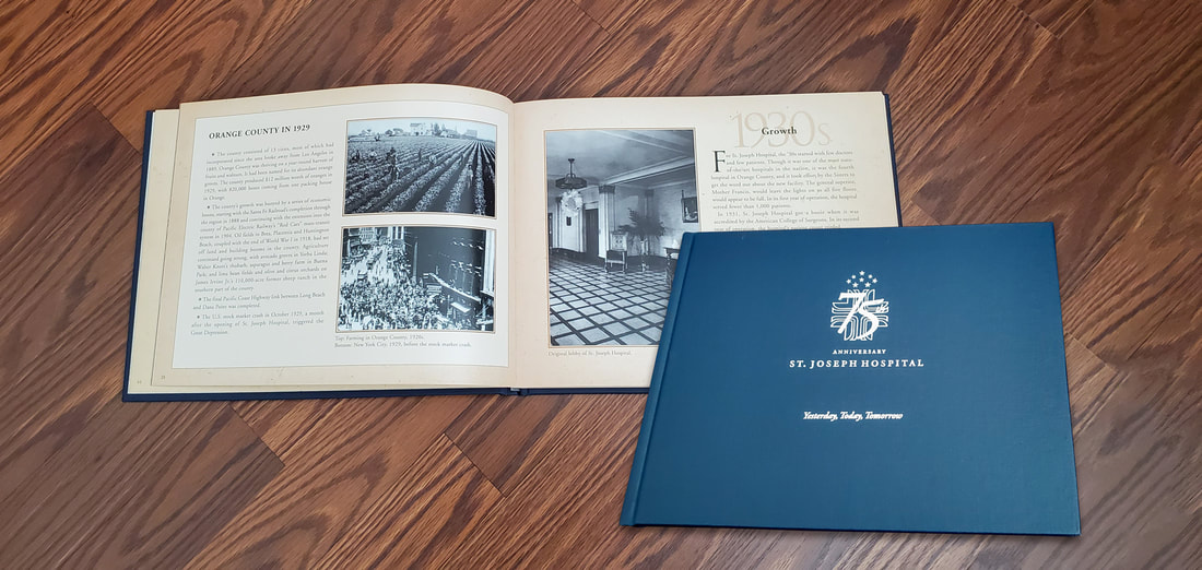
Coffee Table BookCompany: St. Joseph Hospital
Project: 75th Anniversary Coffee Table Book Objective: St. Joseph Hospital was celebrating their 75th anniversary and wanted to pay homage to the rich heritage of the hospital and all those who have served there. They wanted something elegant that would last and could be given to all the investors of the hospital. I created this hard-bound book that had an embossed, foil stamped logo on the cover, with premium heavy paper stock that used a classic handmade paper texture and elegant serif fonts that worked really well with the historic photos used in the book. The hospital executives were very pleased with it and it was even submitted for a design award. |
|
Publication advertisementCompany: Kelley Blue Book
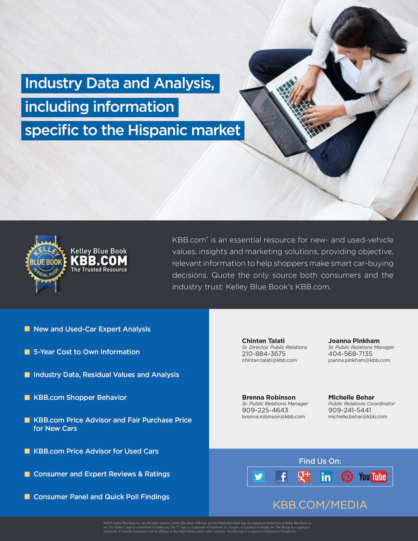
Project: Hispanic Marketing Conference Program Ad Objective: KBB.com wanted to create a presence at a Hispanic marketing conference. I was tasked to create a very clean and simple program ad that made a statement to the conference attendees letting them know that they had data information specific to the latin market. |
|
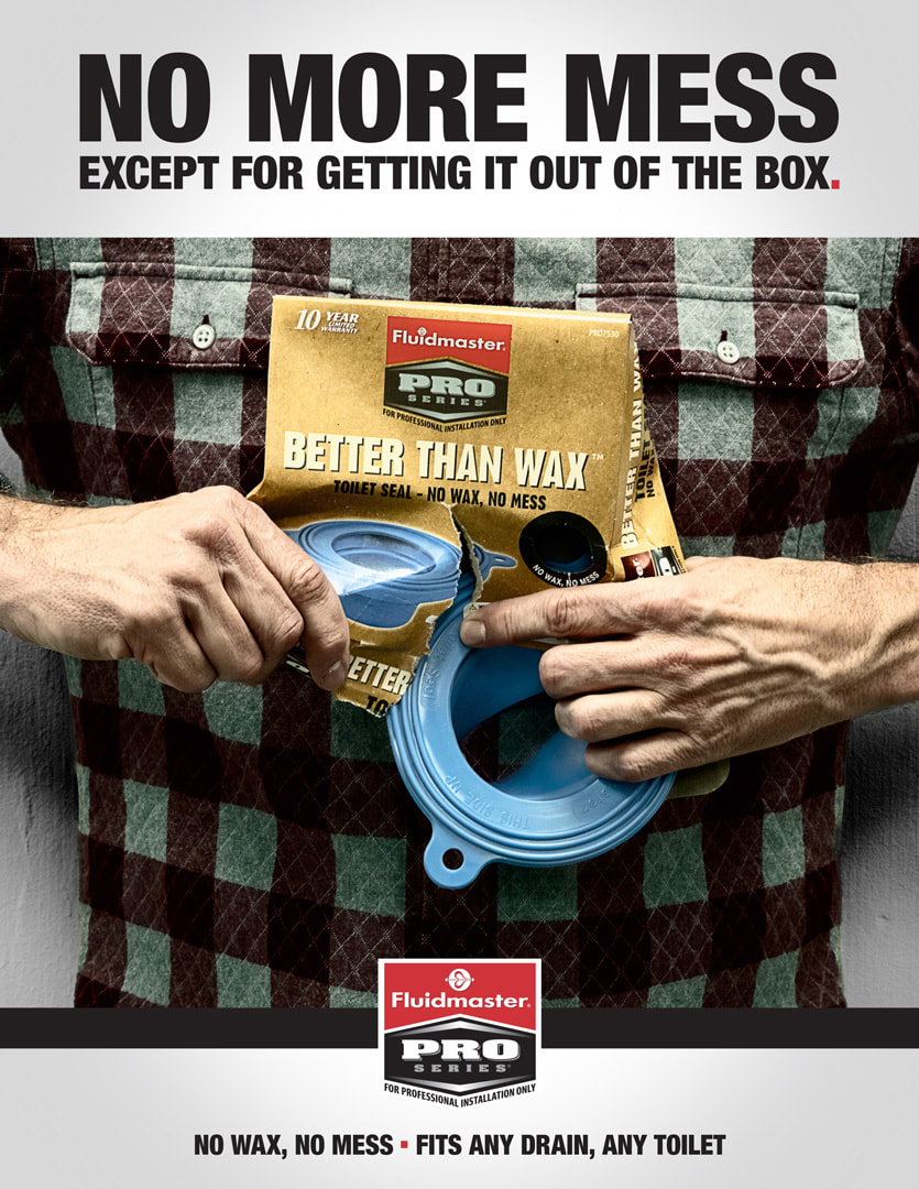
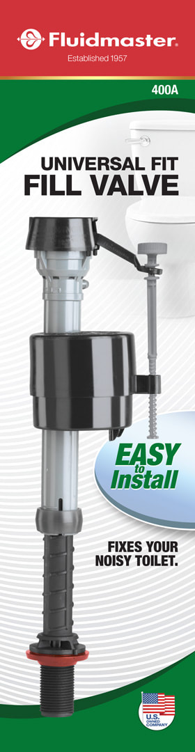
Publication advertisementCompany: Fluidmaster Inc.
Project: PRO Series Better Than Wax Advertisement Objective: Fluidmaster PRO Series is strictly marketed through the wholesale channel to professional plumbers. They are a completely different target market than the average DIYer. They are experienced and want "down and dirty" information on why the product is right for them to use. When creating this print ad, my goal was to keep the messaging simple while having that bold, and "gritty" appearance that appeals to the plumbing professionals through the use of heavy typeface and muted and distressed photo with heavy contrast that creates a visual impact. |
|
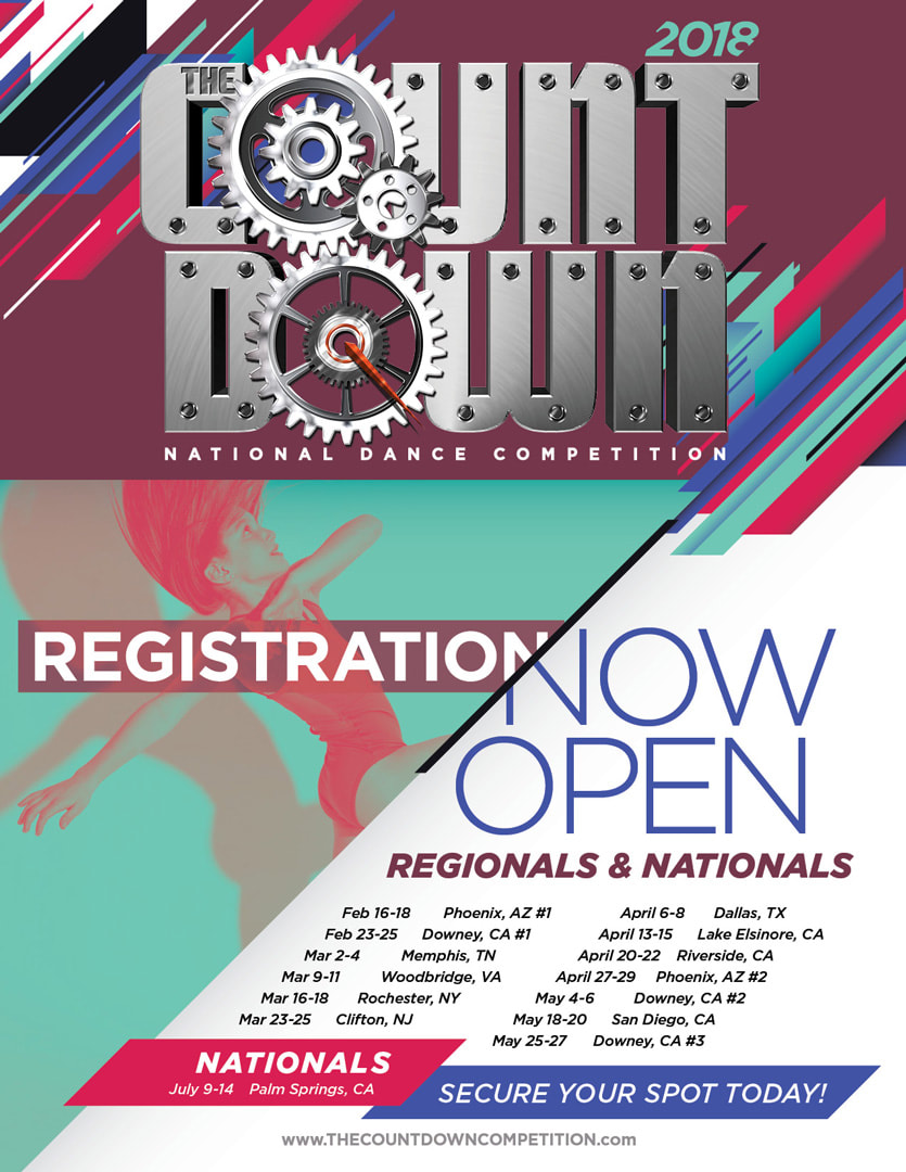
One-sheetCompany: The Countdown Competition
Project: Dance Competition 2018 Tour Dates One-Sheet Objective: Every year, The Countdown has to reinvent itself to stay relevant in the ever-changing landscape of the dance world. I wanted to develop a style for the competition that showed movement and a variety of color that reflects dance. I art directed and designed every print and digital marketing piece for the competition. |
|
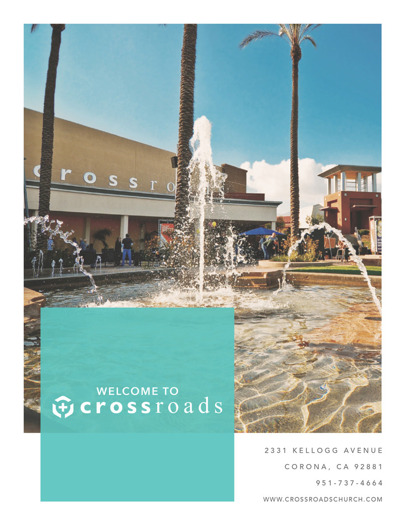
Information bookletCompany: Crossroads Church
Project: Guest Information Booklet Objective: Crossroads Church is a large church that is very grounded in the community. It has been around since 1892 and is one of the oldest in the Corona area. They have a large campus with many ministries and offerings to members and guest visitors. Because of this, I was tasked to create an information booklet for new members or guests who would like to see all that Crossroads has to offer them to become more active with the church. I used a very calming, serene color scheme with clean, light-faced fonts with ample whitespace to invoke a less intimidating experience for the first timers. The beautiful pictures of the campus are colorful with a light matte treatment so the lighting isn't heavy in contrast, which creates a more picturesque backdrop where people can be proud of where they plan to worship in the future. |
|
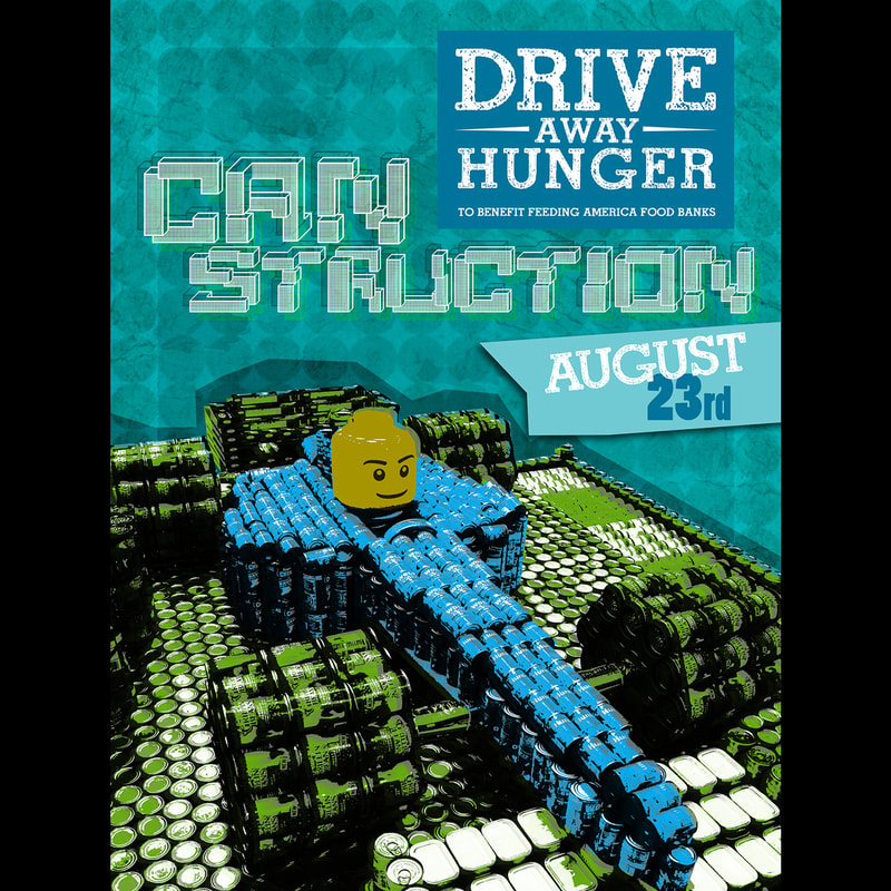
PosterCompany: Cox Automotive
Project: Drive Away Hunger–Canstruction Event Poster Objective: Every year Cox Automotive would an annual food drive to donate food to banks local to it's regional offices. It was a company-wide organized event that donated over 200,000+ meals. The HR team approached me to create a poster design that embodied the event that they could get printed and post in all the national offices. I used a photo of a winning Canstruction display and wanted to implement some textures using circles like the bottoms of the cans. Playing with textures, using a building block style font and the color palette from the Drive Away Hunger program, I created a piece that not only received much attention around the organization, but received a national Graphic Design USA In-house design award for best poster in 2014. |
|
PackagingCompany: Fluidmaster
Project: Global Brand Packaging Revise Digital Concept Objective: After undergoing several consumer studies on their packaging, Fluidmaster learned some vital information that was detouring consumers from in-store purchasing decisions. Participants stated that there was an over-use of the company's trademark Red and Green colors, the messaging was not clear as to what the product was or why they should choose it over the competitor. When tasked with this undertaking, I chose to minimize the Red and Green but still have it seen from 20 feet away. The use of organic lines for the background and shapes surrounding the product image, gave the implication of "water" without having to show actual water along with bold, simplified messaging really helped clean up the packaging which was well received by participants when showed in contrast to the original packaging design. |
|
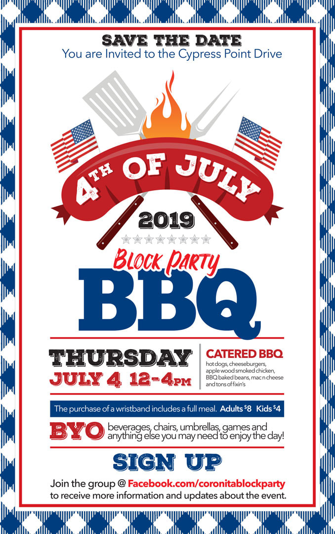
PostcardCompany: Coronita Block Party
Project: Annual Block Party BBQ Invite Objective: Coronita is a small neighborhood in the Inland Empire that is very tight-knit. Every year on 4th of July, the neighborhood gets together to have a block party where all the neighbors block off the residential street and host games, water activities etc. There is always a theme surrounding the event. I was approached to create an invite that embodied the look and feel of a grand, old-fashioned July 4th backyard BBQ. Using a checkered pattern that resembled the typical party table cloth and bold-faced type combined with simplified design elements, this invite had a whimsical look while keeping the important details segmented and an easy read for the viewer. The design was so well received that the event organizer made hats and other memorabilia to give away that people happily accepted. |
|
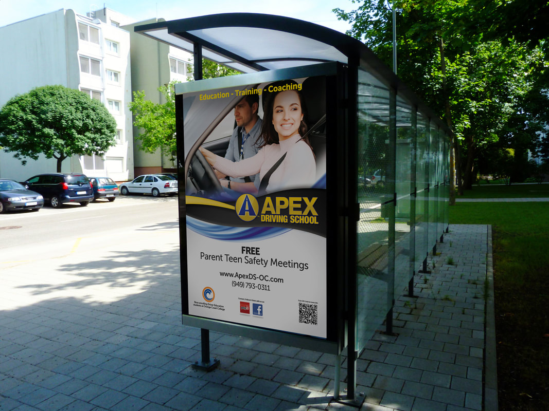
Bus shelter advertisementCompany: APEX Driving School
Project: Bus Shelter Advertisement Objective: APEX Driving School is a business that partners with Orange Coast College that focuses on driving safety from both the student and parent side. They wanted to create a bus shelter advertisement to run around the Orange County area school campuses. They wanted the advertisement to be simple to read and eye-catching at the same time. Using the brand's colors mixed with sweeping organic elements created a sense of movement for the viewers eye. Layering a band of carbon fiber texture with a clean image of a happy student driving connected the car and driver element. The use of a sans-serif font made the ad feel less institutional and more appealing to various ages. |
|
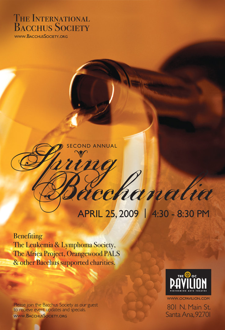
Postcard
Company: The International Bacchus Society
Project: Spring Bacchanalia Postcard Objective: The Bacchus Society is a Secret Society of Philanthropic wine lovers. They hold annual auctions and dinner events to raise money for a variety of charities. They commissioned me to create a postcard that could be placed in stores in the Orange County area that sold wine to raise awareness for the event. The client wanted it to look high-end to attract a more affluent crowd. Using an image caught in the moment of pouring a glass of wine was to invoke that feeling of happiness people feel when with loved-ones sharing a bottle of fine wine. The brown and yellow colors give the piece a distinguished appearance. The play between Serif and Sans-Serif typefaces, allow different pieces of information have hierarchy without competing for the reader's attention. The client was very happy with the design and said it fit very nicely on the counters of the wine retailers. |
|
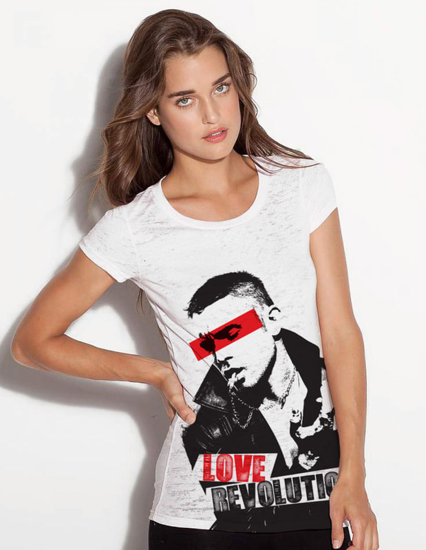
Clothing designCompany: Blake McGrath - Music Artist
Project: Love Revolution T-Shirt Design Objective: Blake McGrath has earned a name for himself in the dance industry backing up mega-stars such as Brittney Spears, Janet Jackson, Ricky Martin and more. He has always had sort of a "bad boy" image in that world. He has now crossed over to be a solo artist with huge popularity in Canada (where he was born) and an increasing audience in the United States. For his Love Revolution album tour, he approached me to create some merchandise that conveyed the edgy sound and style of the album. With this T-shirt design, I took a photo of Blake and converted the image to black and white and bumped up the contrast so there was definitive breaks between the positive and negative areas. Adding a bold, uppercase, distressed typeface married well with the image of Blake. Placing a red bar over Blake's eyes gave it sort of a "punk" edge all while subtly implying the "rose colored glasses" metaphor. Blake was ecstatic about the design and felt it perfectly conveyed everything about the album and where he was artistically at the time. |
|
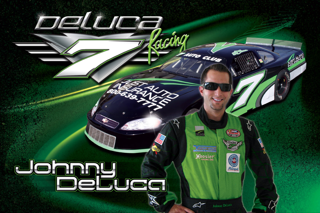
Hero cardCompany: DeLuca Racing
Project: DeLuca Racing Hero Card Objective: Johnny DeLuca is a local, Southern California Auto Club NASCAR racer who is on the rise. Along with his good driving, Johnny DeLuca likes to have a polished image on the track as well. After completing the seasonal graphics for his race car using lime green and black color scheme, he asked me to create a hero card to pass out at the track with the same colors. I wanted the card to be clean but have a racing look to it. I used elements of crackle texture to resemble the asphalt along with large, sweeping light streaks of green to resemble movement and speed. Pairing those elements with chrome gradients and highlight bursts really gave the design the feel I wanted. Johnny, his crew and the fans really liked the cards and he had no problem handing them out at the track! Droves of people came and asked him to sign one for them. |
|
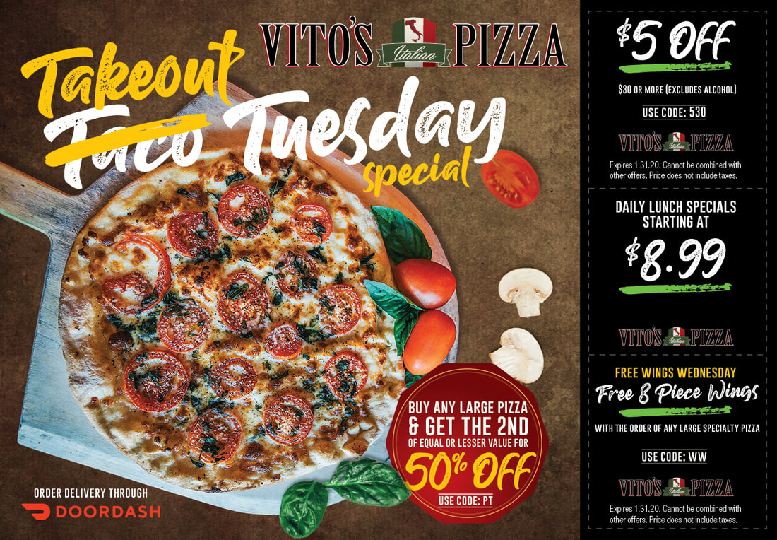
Every door direct mailerCompany: Vito's Italian Pizza
Project: Every Door Direct Mailer Postcard Objective: Vito's is a local Italian food restaurant that has earned a grassroots reputation around town for making authentic Italian dishes with ingredients made from scratch daily. The word of mouth reputation has gained them a sizable following but they were having trouble competing in the pizza market with the large companies such as Domino's, Pizza Hut, Round Table etc. The owner approached me to create an EDDM piece that could be delivered to local resident's doorsteps with specials to encourage them to buy pizza from them instead of the larger guys. When creating the piece, I wanted it to have an authentic look and feel that reflected the restaurant and care that goes into each meal. Using images of fresh basil, tomatoes, mushrooms, red pepper combined with a pizza on a board and playful handwritten typeface gave the design the appearance of hand-crafted food straight out of "Ma's" kitchen. The mailer was successful, it boosted sales roughly 20% and the owner now wants to do these bi-monthly. |
