
|
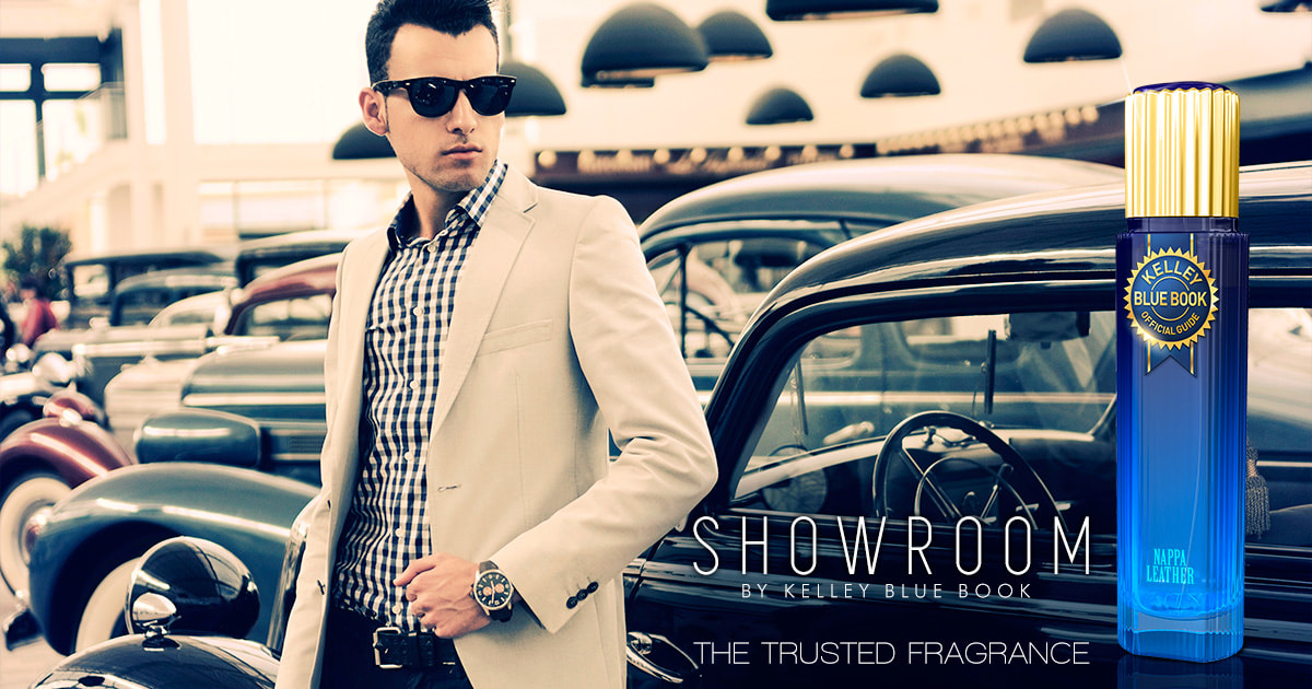
Digital advertisementCompany: Kelley Blue Book
Project: April Fool's Day Digital Ad Objective: Every April Fool's Day, many large companies get involved running phony digital ads that push the boundaries of being taken seriously or not. KBB decided to jump on that bandwagon and create a series of digital ads that bottled up the "new car smell" into 3 different scents. The make-believe scents were called "Showroom by Kelley Blue Book". The use of high-fashion imagery and basic, thin-faced typography set the tone for people to ask the question, "Is this a real thing?" |
|
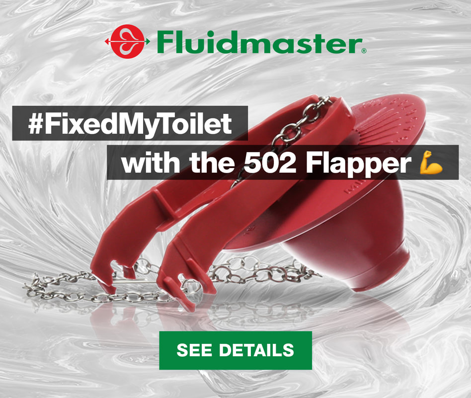
Web banner advertisementCompany: Fluidmaster
Project: 502 Flapper Digital Banner Ad Objective: Fluidmaster's sales team wanted to push the sales of the 502 flapper online so they asked me to create something that would showcase the product well while tying into our social media channel. Since the flapper is what controls the flush in a toilet, I decided to use the clean, swirling water image in the background to tie into the actual function of the flapper. Using the hashtag "#FixedMyToilet" that Fluidmaster uses on all their instruction sheets, helped tie the digital marketing and social channels together and create awareness of the hashtag where new DIYers may see all the other posts of what people fixed on their toilets. |
|
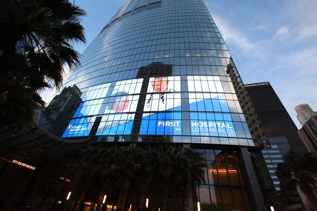
Digital billboardCompany: St. Vincent Hospital / Verity Health Systems
Project: Annual Gala Digital Billboard Objective: St. Vincent Hospital, one of the oldest hospitals in Los Angeles, was recently acquired by the Verity Health System. In preparation for the hospital’s annual charity gala in 2018, Brand New Day was chosen to create a digital billboard that celebrates St. Vincent’s storied past while acknowledging its new ownership. The resulting artwork features a subtle V-shape to showcase the main image and underscore the V in both Vincent and Verity. |
|
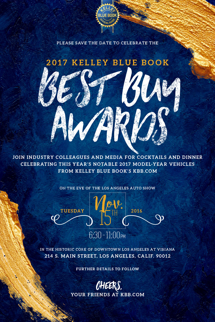
Save the Date E-viteCompany: Kelley Blue Book
Project: 2017 Best Buy Awards Event Save the Date Objective: Every year, Kelley Blue Book hosts an event where they entertain the automotive industry's top executives and media outlets to present the following year's Best Buy Awards to celebrate the most notable model-year vehicles as rated by KBB.com. For the 2016 event, the PR team wanted the theme to be "works of art". With that theme, it was only natural to use brush strokes, canvas textures and a handwritten typeface that all felt as though an artist created each piece individually. Since the Save the Date is the first piece of communication to the attendees, it had to be visually stunning and convey the year's theme right away once the email was opened. The event was classy and stunning down to every last detail. I was proud to be the designer picked for this event (and usually was every year). The Auto Execs had tremendous things to say about the event and is heralded as one of the "must-attend" events of the Auto Show season. |
|
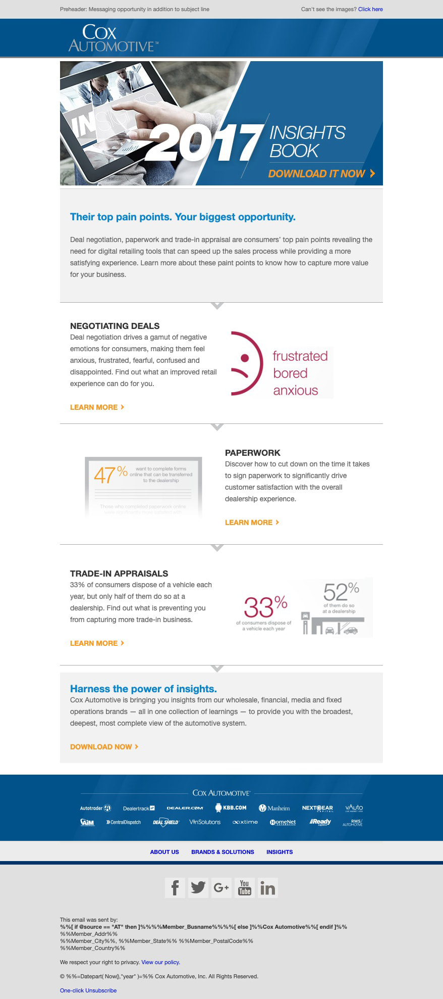
Company: Cox Automotive
Project: 2017 Insights Book Email Objective: Every year Cox Automotive releases an Insights book that is chalk-full of data and analytics gathered throughout the year about car shoppers and buyers and their habits. The insights book explores everything from the shopping experience, to negotiation experience as well and delivery and post-purchase emotions. This very helpful book is shared with everyone who works in the automotive industry so they can better understand their target market. I had the pleasure of being selected to work on this book while working for Cox Automotive. Once the style guide was set for the guide, the email was created to follow the look. Since data can be overwhelming, we kept the artwork very clean and minimalistic so it could be easily consumed visually. |
|
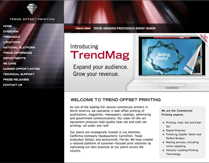
Website developmentCompany: Trend Offset Printing
Project: Company Website Objective: Trend Offset is one of the leaders in offset printing out of Southern California. They are experts in printing, heat-set, cold-set, finishing, saddle-stitching and more! Having worked with them often at the Orange County Register was an open door for when they wanted to recreate their company website. Since they have a lot of services to offer, the client and I chose to keep the layout very clean and easy to navigate. Since the website has been overhauled and live, clients have appreciated the fresh new approach and ease of navigation for their shopping experience. |
|
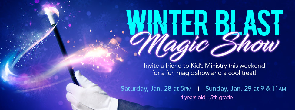
Web banner advertisementCompany: Crossroads Church
Project: Magic Show Web Banner Advertisement Objective: Crossroads Church wanted to advertise that they had a special magic show treat for their weekend kid's ministry. They approached me with the theme "Winter Blast Magic Show". Since it was supposed to convey fun, magic and winter, I chose to use a color palette of light blues, purples and white. Along with the magic wand image, I overlaid a texture of "dust" to give it feeling of sparkling magic. Using the font that had a bit of movement in it also gave the design a look of a blast happening from right to left. The staff was very happy with the design and let me know they had a good turnout! |
|
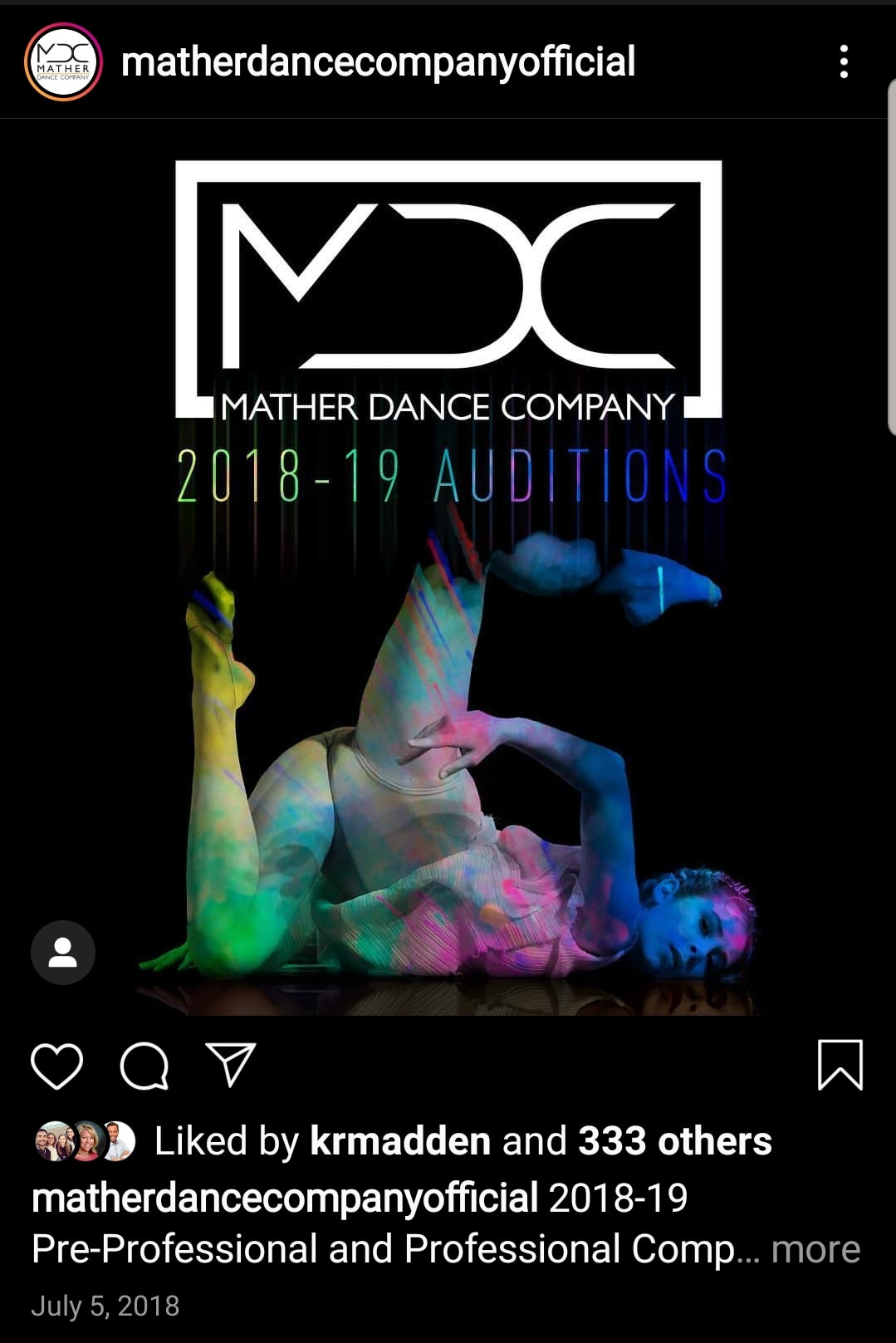
Social media advertisementCompany: Mather Dance Company
Project: Auditions Social Media Advertisement Objective: Every year Mather Dance Company holds auditions for their following season's competing dance routines. MDC has a 100K followers so they like to get the word out through social media. Shannon Mather, the studio owner-director asked me to create something eye-catching using an image of her daughter she provided. We have been introducing vibrant colors into the advertising for some time now, so I thought about making Emma's image black and white and using it to be a "window" to introduce some color and smoke textures into. The image came to life and was even more striking than I anticipated. Shannon was ecstatic about the ad and wanted to post it immediately! |
|
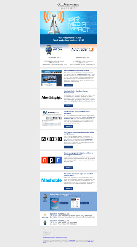
Company: Cox Automotive
Project: Media Impact Informational Email Objective: Every month Cox Auto would release an email detailing the previous month's PR media impact to the organization. The email's purpose was to outline how many ad placements and total media impressions there were between Autotrader and KBB.com. In creating this email, the information needed to be easy to consume while segmenting each instance where published articles referenced one of the two automotive companies. I designed the email to have cells that were segmented so the stories could stand on their own and be easily read on mobile devices as well as desktops. The email was well received by the executives of the companies and they looked forward to reading them monthly. |
|
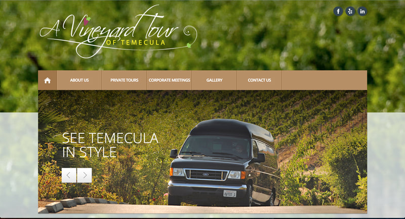
Website developmentCompany: A Vineyard Tour of Temecula
Project: Company Website Objective: A Vineyard Tour of Temecula is an executive-class wine tour experience of the Temecula region wineries. They offer a 6 person, limo van to drive groups of people to local wineries and give them a 5-star treatment traveling to each winery for the day. When asked to create their business's website, I wanted to capture the elegance and premier experience their customers enjoy on their tours. Hiring a photographer to follow customers on their adventures to the wineries provided a perfect visual representation of what AVTOT is all about. I kept the website simple and easy to navigate while using clean type treatments and big, beautiful photos of the van and locations. The goal was to have the consumer get the whole AVTOT first-class experience from the moment they did their research on the internet. The website and experience was so pleasurable it has a 5-star rating on Yelp |
|
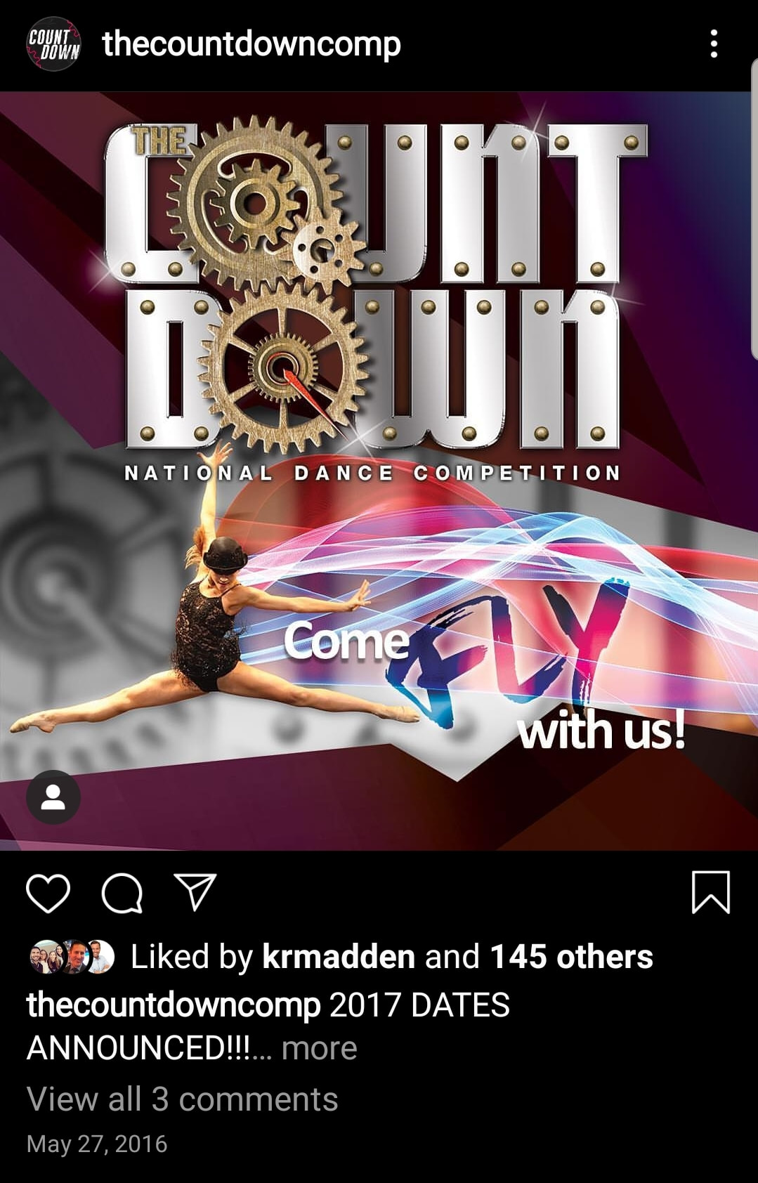
Company: The Countdown Competition
Project: Social Media Advertisement Objective: The Countdown Competition is recognized nationally for the pool of talented dancers that compete on their stages across the country. Every year, they announce the following year's tour dates ahead of time so studios can plan to fit the competition into their schedules. For 2017, the theme was "Come Fly With Us!" so I wanted to show movement by combining light trails blended into dance photos the owner provided me with. Using a more subdued color palette of burgandies, deep blues and black provided the visual contrast needed to allow the dancer photos and light trails to stand out. The competition has a large social following and every time we post an advertisement, there is a lot of engagement on the post. |
